
Sichuan Pepper Chinese Restaurant
Brand Development
Preface
During my time as the Senior Graphic Designer at Mobile Defenders, the marketing team was in talks with company ownership regarding the possibility of branching off into our own agency. We had seen other teams, such as the website development team and the Chromebook operations team do so already, so it wasn't a stretch for us to imagine doing the same. As part of the proposal, I was tasked with putting together several logo designs as a means of demonstrating what our team would be capable of.
Business Concept and Research
The ownership group that held Mobile Defenders in their portfolio also owned another restaurant at the time called Sonder Eatery. Our idea with Sichuan Pepper was to demonstrate how the ownership team could make inroads investing in other restaurants.
Because of my heritage, I grew up in a household where Asian foods were the norm. One of my mom's first jobs when she immigrated to the U.S. was as a line chef at an Asian restaurant. Sichuan Pepper was my sort of obvious first take on the restaurant idea for the team.
Logo and Logograph Design
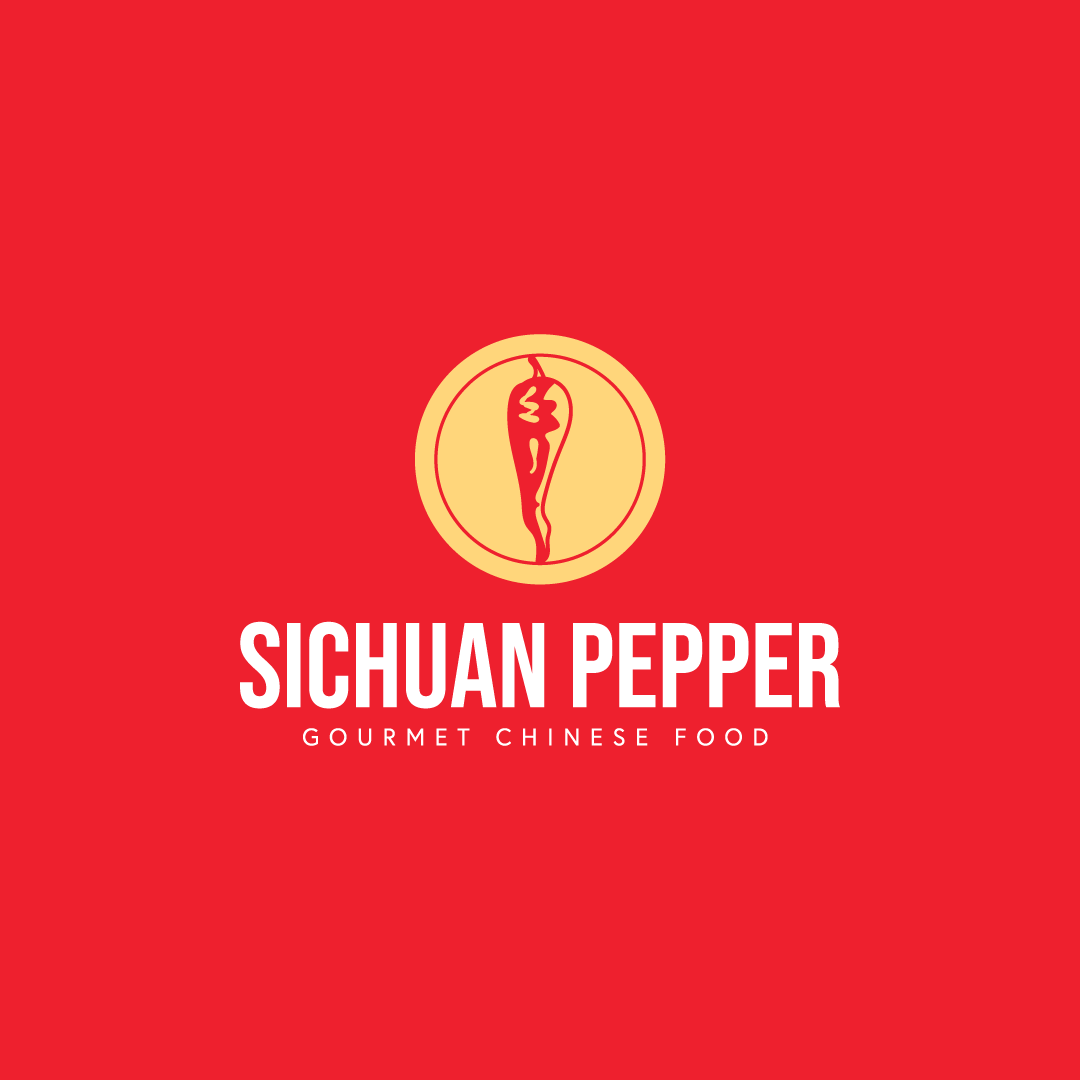
Sichuan Pepper was another logograph that was right on the nose. I chose to create a heavily stylized, two-toned, illustrative image of a pepper from the Sichuan region. The decision to wrap the logograph in a circle was a team decision. There were some who felt that the pepper by itself was a bit too plain. Others also felt that leaving the pepper atop the display text made it look too similar to the logo for Chili's. One circle felt too similar to another logograph we had created as well, so we added a second circle as an outline in the red to add some visual interest.
Brand Colors
It's no secret that many Chinese restaurants within the U.S. use the colors red and yellow in their logos and branding. Both colors have an association with the Chinese flag, which invokes a sense of pride in the heritage from which the cuisine is born. I made this argument and the team agreed that to pay homage and respect, we should do the same.
Star Gold
#ffd77c
R255 G215 B124
C0 M15 Y61 K0
Proud Red
#ef1a2a
R239 G26 B41
C0 M99 Y92 K0
White
#ffffff
R0 G0 B0
C0 M0 Y0 K0
Brand Collateral
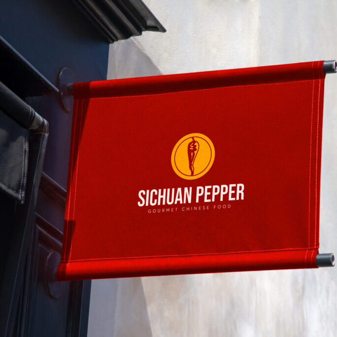
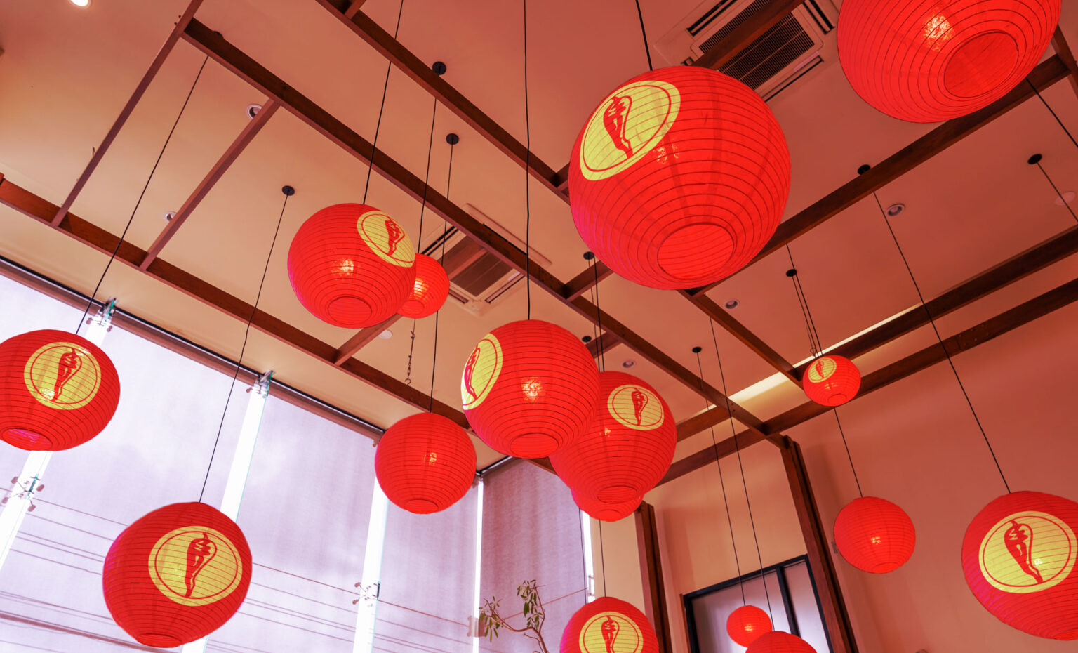
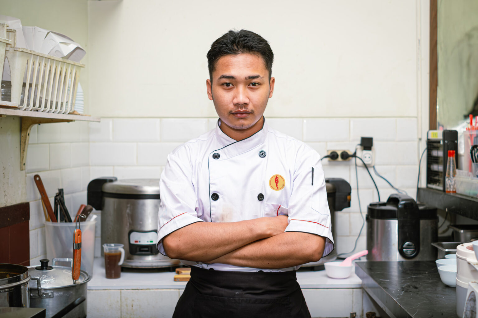
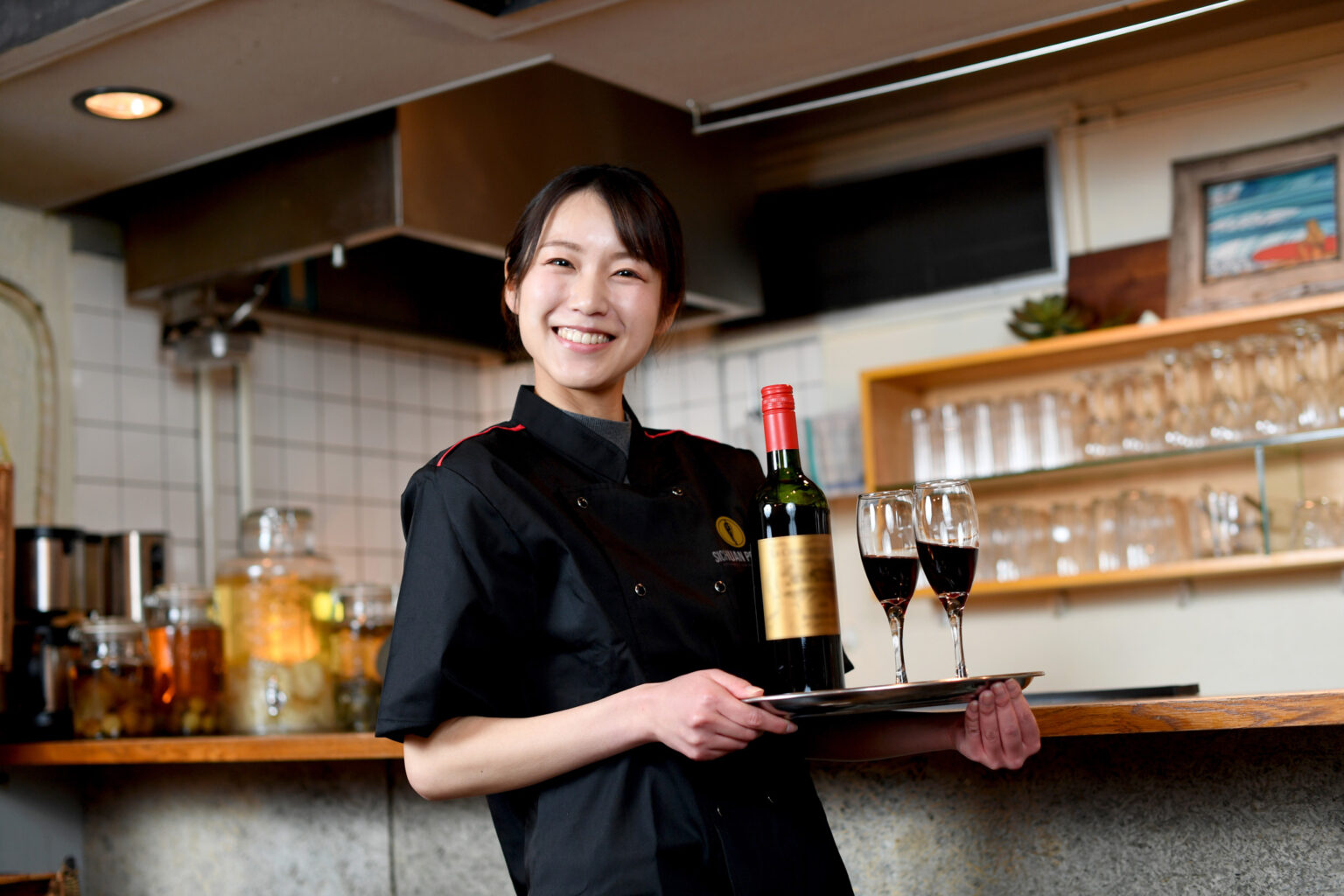
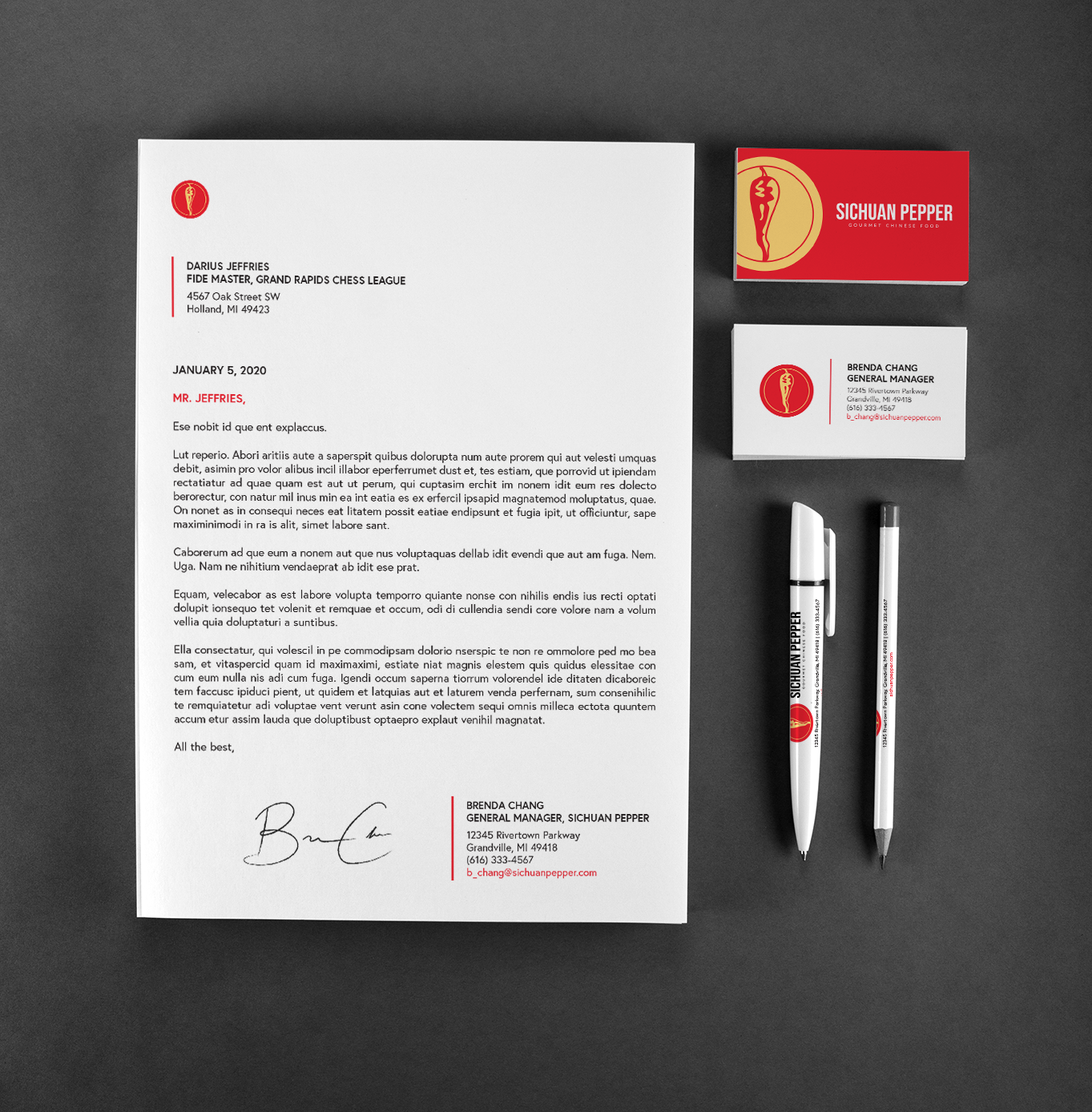
For the brand collateral, we focused specifically on what one would see in a Chinese restaurant. Aprons and Chef's jackets made the most sense to start with. We also thought about places in the interior where we could add branding. We also didn't want to miss the opportunity to design a sign for the storefront and chose something that looked classier/more upscale.
Click on the gallery to see it in full screen.
Conclusions
Restaurant branding is probably one of the more interesting types of design projects. There are a lot of not-so-obvious opportunities to create branded material for a restaurant, and each one is different and interesting in its own way. I would honestly love to do more restaurant work, especially from the ground up.

Conclusions
Restaurant branding is probably one of the more interesting types of design projects. There are a lot of not-so-obvious opportunities to create branded material for a restaurant, and each one is different and interesting in its own way. I would honestly love to do more restaurant work, especially from the ground up.
Interested in Working Together?
If you felt like this project resonated with you or you found it interesting and would like to work on something similar together, I'd love to chat about it. You can reach out to me via the info on my contact page, or feel free to continue checking out more of my work!